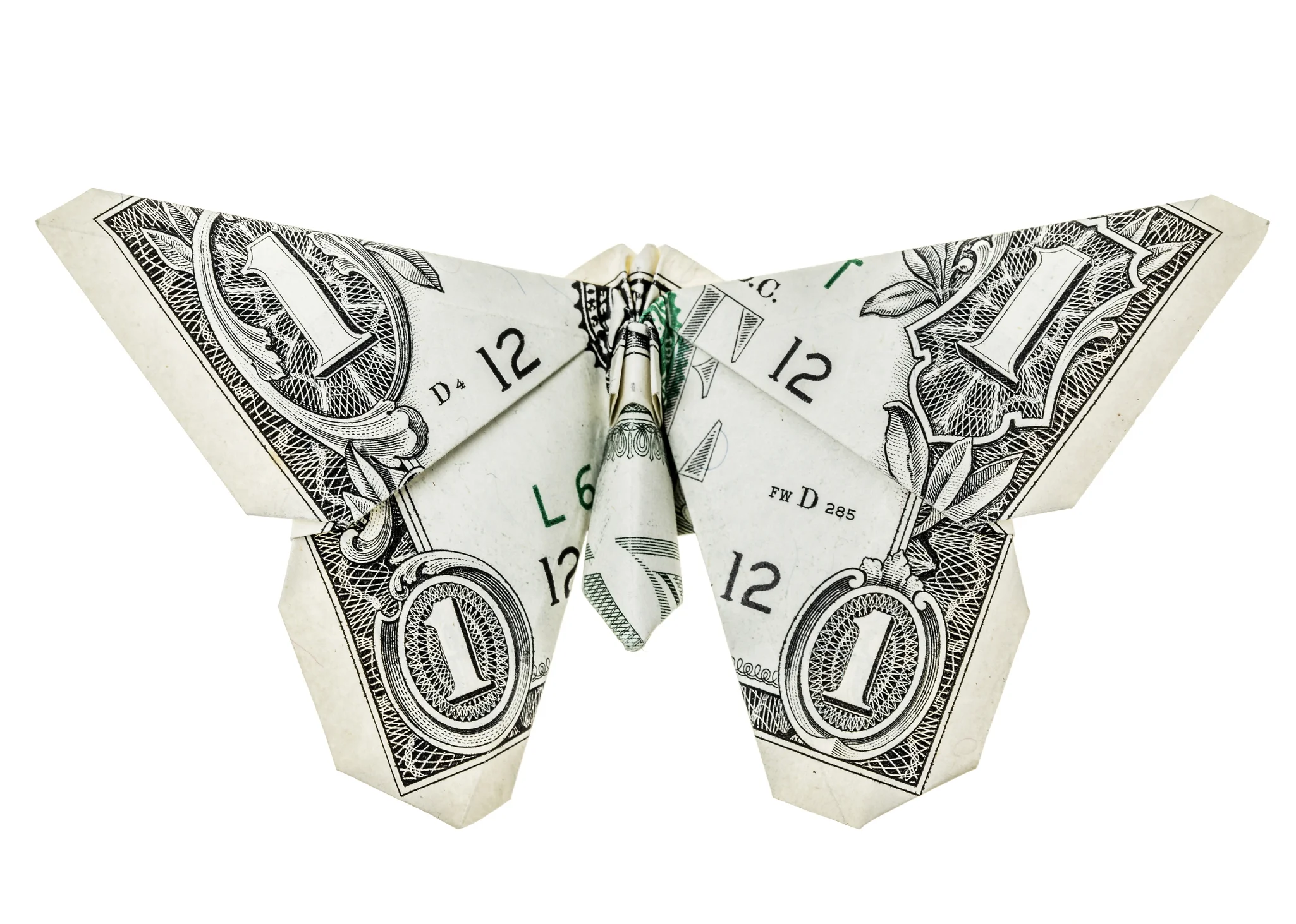
I was watching the NOVA episode on "The Origami Revolution" and was fascinated by the computer-aided designs and the complex math formulas the researchers were using to design software that help create complex designs. Part of this made me think about recent studies and competitions where pairing humans with computers perform better than either one alone. The intricate origami shapes blew my mind (Google search images of "complex origami" and you'll see what I mean).
The episode had me thinking about fractals, and of course Benoit Mandelbrot and his book on "The Misbehavior of Markets", where he discusses the fractal nature of markets, driven in part by a momentum factor. I wonder if the folding and unfolding of origami figures and shapes can teach us something about market behavior. Specifically the math being used in the software to calculate the number of folds to create a specific shape - could this math help describe, or at least provide another view on how markets can rise and fall? The NOVA episode also covered naturally unfolding events in nature - flower petals from buds, insects wings collapsing and expanding instantly. The momentum behind the unfolding (i.e. expanding) and folding back (i.e. crashing) of markets may be an interesting perspective that may yield some insight on the interplay between ETFs and active management.
The links between the folds and how the shapes morph together from a single sheet of paper led me to start thinking about markets and ETFs. ETFs are after all baskets of investments linked together - similar to mutual funds but with the added feature that you can trade them all day. ETFs have had their share of critics and concerns. Add the fact that's it's usually only a handful of stocks driving performance in an index, and you can start to visualize how momentum, interconnectedness, correlations, etc. can cause some uniform behavior in markets - meaning "bad" stocks go up in a rising market, and great stocks go "down" in a declining market.
Much has been written about how passive management, or indexing, is hurting active management. For common investors who don't have time to research, who want to set and forget it, this is generally considered a good thing (whether such a casual approach to investment should ever be considered is a separate debate - i.e. while the relatively short U.S. stock market history suggests yes, world history may suggest otherwise). There is also plenty of research that demonstrates how difficult it is to beat the market over long periods of time. So it would seem that active management is perhaps in a permanent decline (we can include the exodus from hedge funds as well). However, I thinks this line of thinking between origami, ETFs, and potential for the broader market to misprice assets suggests there is still room some active management.
Future Outsized Gains?
Before I go down to far the favorable active management outlook, I will the disclose that I am mostly a passive investor, with some play-money in what I would consider a milder version of the Buffet S&P portfolio (90% S&P is too high for my taste - my play-money is about 60% in individual U.S. Large Cap stocks, with 40% split between high quality short-term and mid-term bonds - overall portfolio is much close to the 50-50 split, including minor percentage in international - vast majority being in Vanguard index funds). I believe there is room for active managers but I remain mostly passive because as the research suggest, I don't know enough about active managers to know who is lucky and who actually knows what they are doing (my play-money is designed to cure my own human urge to buy something from time to time just because I like it and basic valuations looks good - it allows me to leave my long-term indexed funds alone).
How does origami, folding-unfolding, ETFs and active management fit together? My thoughts centered on the idea of folding points on the paper and how a single point can morph the whole sheet (similar to an extremely large mass folding space-time). This is how a bad market can drag down "good stocks." At this low point is where active managers can pick out the quality stocks (echoes of Buffett), be patient, and waiting to ride the wave (i.e. unfolding) upwards. The next assumption is that other market participants also discover these great stocks and push prices higher. At some point, the indexes - especially market weighted indexes - have to reset their benchmarks. I'm make a wild guess that this is where momentum really takes off, where the quality stocks take off and lift the indexes.
CONCLUSIONS?
Maybe I'll get lucky and one of my picks in the play-money pot will grow exponentially over time similar to Berkshire's rise over the last 30+ years. I'm looking at you Alphabet/Google - but at some point that revenue driver will need to be more than ads. The more likely scenario is that I will not get a lucky pick, and my indexed investments will outperform my picks. The comparison between my play-money portfolio and my overall portfolio lays out why most people should just index. However, it also leaves room for active managers to take some outsized gains if they can pre-select the quality stocks that will drive the indexes. The difficulty is that this rationale suggests these active managers have to better than everyone else at picking the best stocks - significantly better.
The Truth?
The reason for this post is that I really want to see someone develop a visual of what Origami markets would look like. Perhaps someone already has and I'm not aware. The picture I have in mind is of different stock tickers spread throughout a plain, and then the plain crumples, folds, and twists based on market returns at the location of that ticker symbol. The size of the folder are determined by a mix of market cap and percentage change. The geometry and other maths they use in the origami design software is beyond my expertise, but I wonder if there's any way to take market data and see what kind of art it could randomly generate. Will it be a garbled mess, or a nice sequence of shapes? I imagine if this makes sense to anyone, it will likely be used to make money first, before we get to the art.
The time lapse videos of flowers and tree leaves unfolding are magnificent. Traditionally we only stock and market charts as jagged lines. There are other two-dimensional representations. Then there are the many formulas. I would just like to see what different 3D images could be developed if we visualized market movements and flows through a broader spectrum than that of flat paper, to flat screens, to complex equations. Maybe origami can be the spark for some one else to pursue that line of thinking - if not for art, at least for profit. If you ever do, please share the visuals with me.